Warehouse Management App for Logistics Teams

Warehouse Management App for Logistics Teams

Warehouse Management App for Logistics Teams

Role

Role

Sole Product Designer & Researcher

Sole Product Designer & Researcher

TIMELINE

TIMELINE

90 Days

90 Days

Tool

Tool

Figma

Figma

Team

Team

Developers and Testers

Developers and Testers

platforms

platforms

Tablet-first, mobile-supported

Tablet-first, mobile-supported

wms app
wms app

Project Summary

As part of our mission to build an all-in-one freight forwarding platform, I designed a Warehouse Management System (WMS) application tailored for tablets and mobile. The goal was to give warehouse teams; operators, managers, and business owners. A seamless way to handle inventory, shipments, and storage zones, all from a real-time, responsive interface.

As part of our mission to build an all-in-one freight forwarding platform, I designed a Warehouse Management System (WMS) application tailored for tablets and mobile. The goal was to give warehouse teams; operators, managers, and business owners. A seamless way to handle inventory, shipments, and storage zones, all from a real-time, responsive interface.

Background & Opportunity

This wasn’t a redesign. It was a brand new product we introduced based on direct customer requests. Our freight customers were actively managing shipments but lacked an integrated tool for warehouse tracking. They were using third-party software or manual methods for:

  • Managing SKUs and stock locations

  • Tracking inbound/outbound shipments

  • Organizing multi-zone warehouse layouts

Customers asked

“Can you add a WMS inside your system? We want one place to manage everything.”

This gave us a clear opportunity to build a simple, effective WMS that lives inside the same product suite without overwhelming users.

This gave us a clear opportunity to build a simple, effective WMS that lives inside the same product suite without overwhelming users.

Understanding the User Landscape

Even without deep user pain points, I could sense a core need: reduce software fragmentation. Most warehouse teams were forced to jump between tools for inventory, orders, and logistics. Our vision was to centralize it — and keep it lightweight.

What guided my thinking
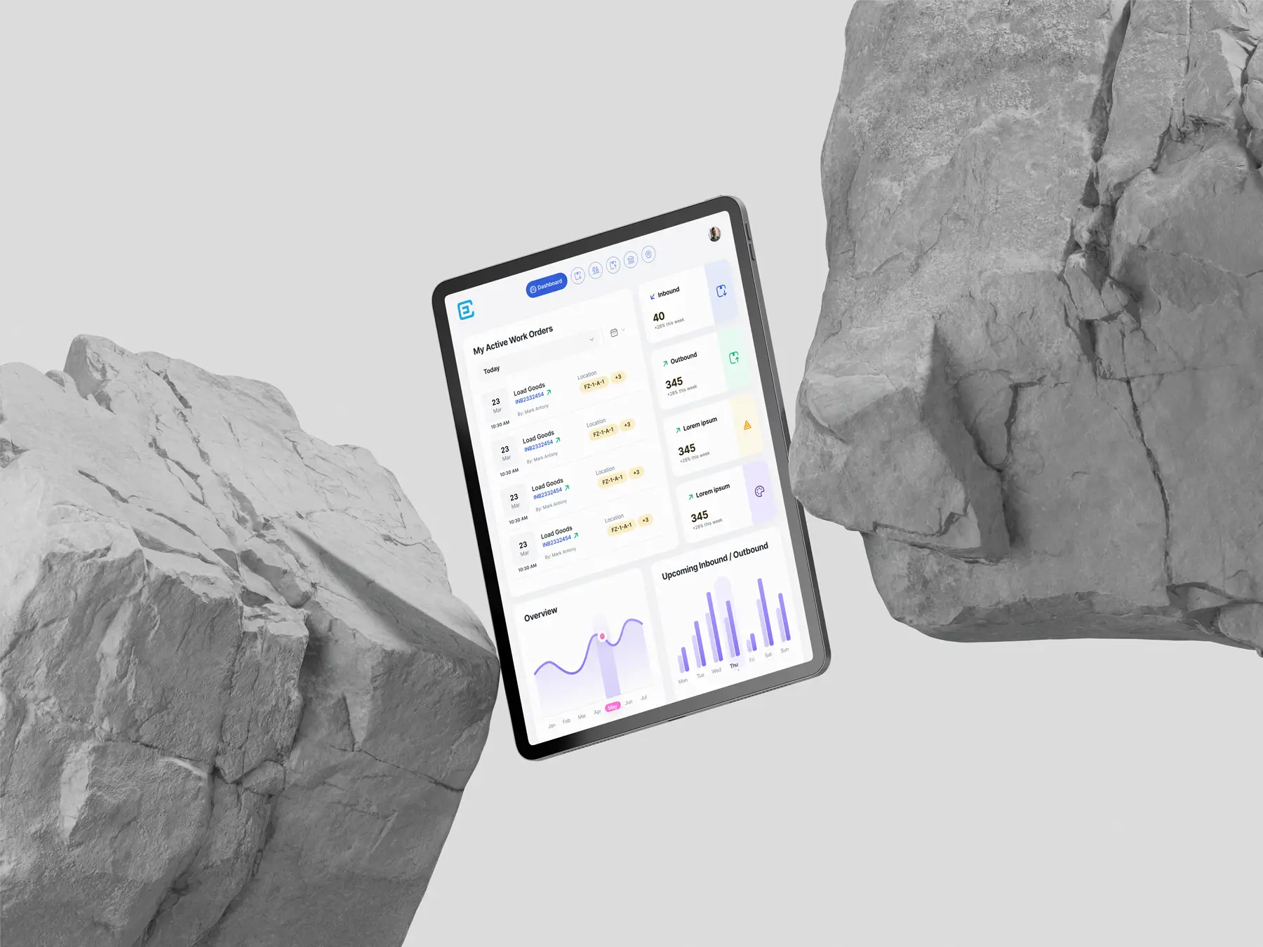
  • Warehouse operators often use tablets while walking or scanning items.

  • Mobile support was a secondary but essential requirement.

  • The experience needed to be real-time, glanceable, and responsive.

I studied popular tools like Fresa, Magaya, CargoWise, GoFreight, and CartonCloud. These helped shape key flows — but many lacked clean UI or mobile support.

Process: Following the Double Diamond

Discover

I reviewed:
  • Competitor UI patterns and pain points

  • Real warehouse workflows like bin mapping, stock lookup, and zone management

  • Layout preferences across tablet and mobile devices

Define

I mapped out the critical features:
  • Inventory visibility with SKU-level accuracy

  • Multi-warehouse tracking

  • Inbound/outbound order flows

  • Storage zone mapping

  • A dashboard with key metrics

Develop

I created flows that matched operator behavior:
  • Minimal taps to update stock or scan orders

  • Responsive tab layouts for different orientations

  • Optimized spacing and sizing for gloved hands and poor lighting conditions

Deliver

Final files were handed off with:
  • Responsive components

  • Screen variants for landscape/portrait

  • A clearly organized Figma structure by features (Inventory, Orders, Locations, Shipments)

  • Notes and constraints defined for each section

Design Components & System

I built the design system using Atomic Design methodology:This structured approach helped in more ways than one:

  • Atoms: Colors, typography, spacing

  • Molecules: Tags, buttons, badges

  • Organisms: Item cards, order panels, location trees

  • Templates: Inbound/outbound flow, inventory view

  • Pages: Final screen compositions

Designing for Tablet + Mobile

One of the biggest challenges was designing for two device types:

  • Tablets required both landscape and portrait layout support

  • Mobiles only supported vertical layout with limited space

  • Features like location management with detailed bin structures were particularly hard to scale down

My goal wasn’t just to shrink the layout, but to preserve usability across contexts. That meant:

  • Using accordion-style views on mobile

  • Prioritizing the most actionable data upfront

  • Reducing friction for repetitive tasks like status updates or stock transfers

Developer Handoff & Workflow Structuring

Designing clean UI was just one part of the job. Making it easy for developers to navigate and implement was equally important. Here’s how I streamlined the workflow.

Designing clean UI was just one part of the job. Making it easy for developers to navigate and implement was equally important. Here’s how I streamlined the workflow.

Responsive Layouts

Organized Figma Sections

Clean Layer Naming

All screens were built using auto-layout and constraints, based on a 4-point grid. This ensured consistent spacing and predictable scaling across tablet and mobile views.

Responsive Layouts

Organized Figma Sections

Clean Layer Naming

All screens were built using auto-layout and constraints, based on a 4-point grid. This ensured consistent spacing and predictable scaling across tablet and mobile views.

Responsive Layouts

Organized Figma Sections

Clean Layer Naming

All screens were built using auto-layout and constraints, based on a 4-point grid. This ensured consistent spacing and predictable scaling across tablet and mobile views.

Results & Impact

The app is currently in beta, and early feedback has been encouraging:

While we didn’t have deep analytics (since it was early-stage), we received strong feedback from internal teams and customers.

“This is so much easier than the older system we were using. The interface actually makes sense for a warehouse.”

“This is so much easier than the older system we were using. The interface actually makes sense for a warehouse.”

While we’re still rolling out to our full customer base, here’s what we’re seeing:App Store descriptions and screenshots

  • Users love the UI clarity and responsiveness

  • Stakeholders praised the layout adaptability and clean structure

  • We're continuing to iterate on flows based on live usage and feedback

Final Thoughts

This project gave me a deep appreciation for warehouse operations not just as logistics, but as real-time systems that people live inside every day. Designing something that worked under practical constraints on tablets, in motion, under pressure made me better at designing for the real world, not just the screen.

This project gave me a deep appreciation for warehouse operations not just as logistics, but as real-time systems that people live inside every day. Designing something that worked under practical constraints on tablets, in motion, under pressure made me better at designing for the real world, not just the screen.

Credits

QA Engineer: Kishore

Credits

This project was designed as part of my role at Avow Solutions Inc. CargoEZ is a product of Avow Solutions Inc., and all rights to the product belong to them. This portfolio entry showcases my design contributions, including UI/UX design, design system development, and prototyping.