Redesigning CargoEZ - A Modern SaaS Website for Freight Forwarders

Redesigning CargoEZ - A Modern SaaS Website for Freight Forwarders

Redesigning CargoEZ - A Modern SaaS Website for Freight Forwarders

Role

Role

Product Designer & No-Code Developer

Product Designer & No-Code Developer

Duration

Duration

3 Months

3 Months

Tools

Tools

Framer & Adobe Suite

Framer & Adobe Suite

Team

Team

Content writers, Motion Graphics and SEO specialist

Content writers, Motion Graphics and SEO specialist

cargoez website thumbnail

About CargoEZ

CargoEZ is a cloud-based freight management Software built by Avow Solutions, designed specifically for the logistics industry. From freight forwarders and NVOCCs to warehouse teams and shipping companies. It simplifies complex operations like booking, tracking, documentation, CRM, accounting, and warehouse management, all under one digital roof.

CargoEZ is a cloud-based freight management Software built by Avow Solutions, designed specifically for the logistics industry. From freight forwarders and NVOCCs to warehouse teams and shipping companies. It simplifies complex operations like booking, tracking, documentation, CRM, accounting, and warehouse management, all under one digital roof.

Challenges with the Old Website
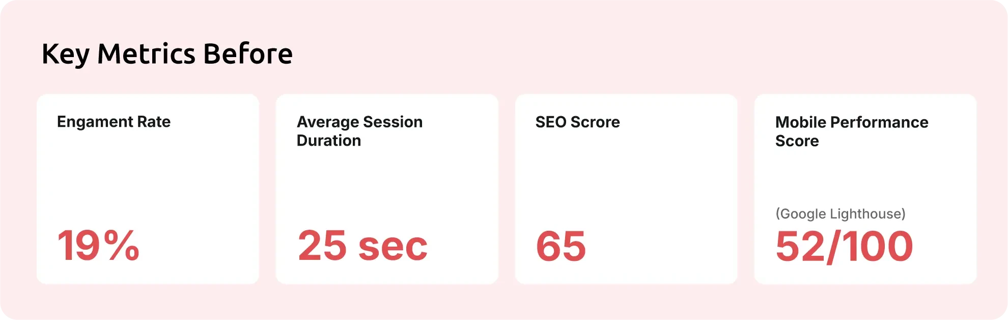
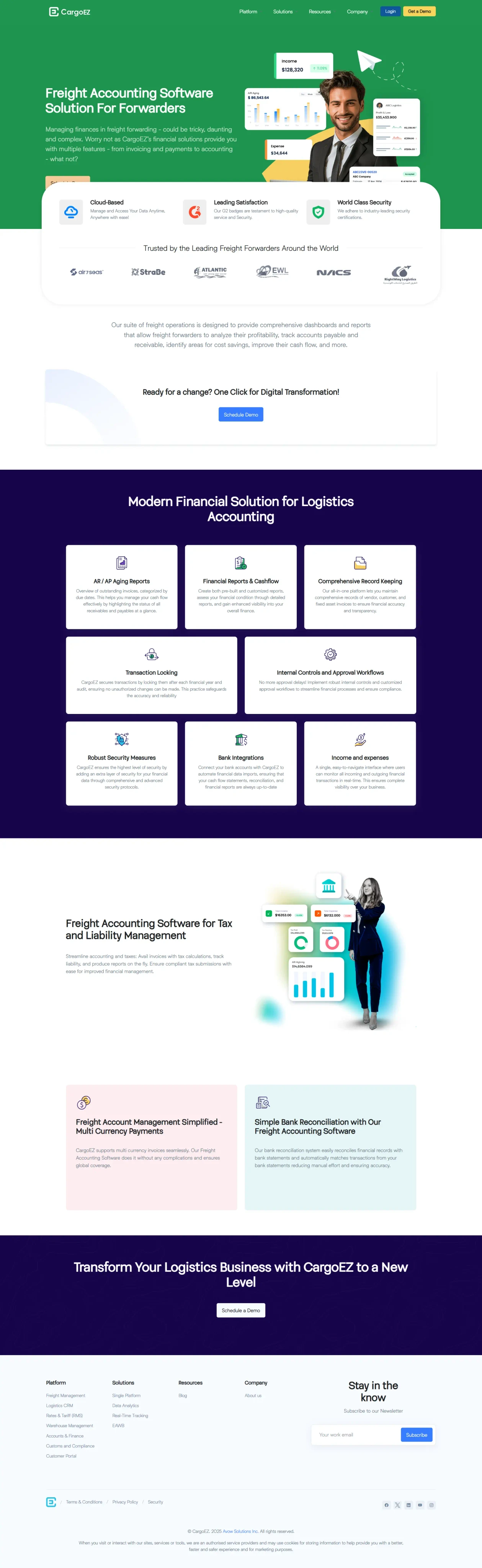
Outdated Design
Outdated Design
Outdated Design

The visual design felt tired and didn’t represent CargoEZ as a modern SaaS product built for logistics professionals.

The visual design felt tired and didn’t represent CargoEZ as a modern SaaS product built for logistics professionals.

Low Conversion Rates

The site struggled to turn visitors into leads or demo requests. It lacked a structured journey and clear calls to action.

The site struggled to turn visitors into leads or demo requests. It lacked a structured journey and clear calls to action.

No Motion or Interactivity

The user experience was flat and text-heavy. There were no animations or interactions to guide users or hold their attention.

The user experience was flat and text-heavy. There were no animations or interactions to guide users or hold their attention.

Thin Content
Thin Content
Thin Content

Key product features weren’t explained well. Visitors had to talk to sales just to understand what the platform could actually do.

Key product features weren’t explained well. Visitors had to talk to sales just to understand what the platform could actually do.

Mobile UX Issues
Mobile UX Issues
Mobile UX Issues

The mobile version had poor spacing, weak typography, and cluttered layouts. It didn’t meet modern SaaS usability standards.

The mobile version had poor spacing, weak typography, and cluttered layouts. It didn’t meet modern SaaS usability standards.

Discovery & Research

To understand the gaps and opportunities, I started by collecting insights from three core sources: internal teams, direct competitors, and user behavior data.

Stakeholder Interviews

Competitor Analysis

Google Analytics

Discussions with stakeholders, sales, and support teams highlighted that clients frequently struggled to find information on modules, features, and platform use cases.

Stakeholder Interviews

Competitor Analysis

Google Analytics

Discussions with stakeholders, sales, and support teams highlighted that clients frequently struggled to find information on modules, features, and platform use cases.

Stakeholder Interviews

Competitor Analysis

Google Analytics

Discussions with stakeholders, sales, and support teams highlighted that clients frequently struggled to find information on modules, features, and platform use cases.

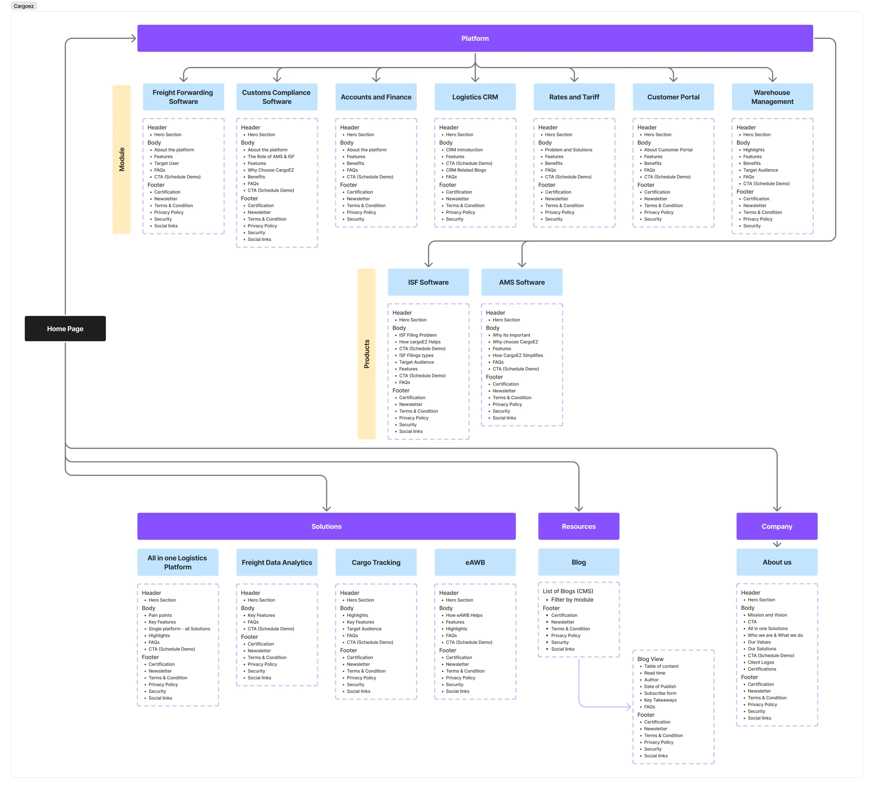
Strategy & UX Process

Information Architecture

Information architecture

One of the first steps was simplifying the site’s structure. The original navigation felt cluttered and made it harder for users to find what they were looking for. I focused on making the flow more intuitive and easy to scan.

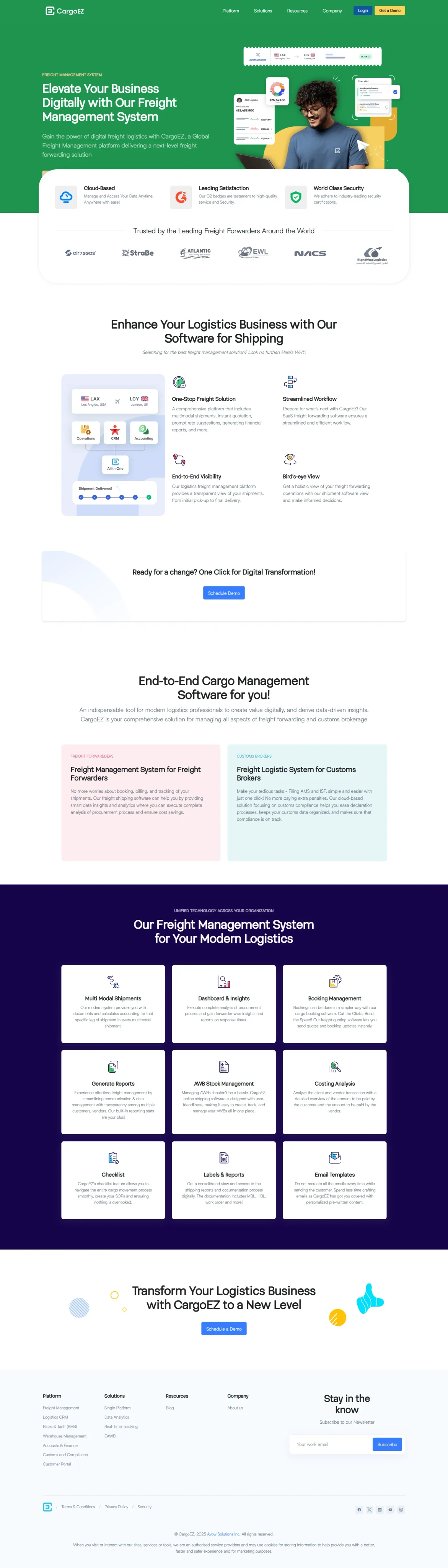
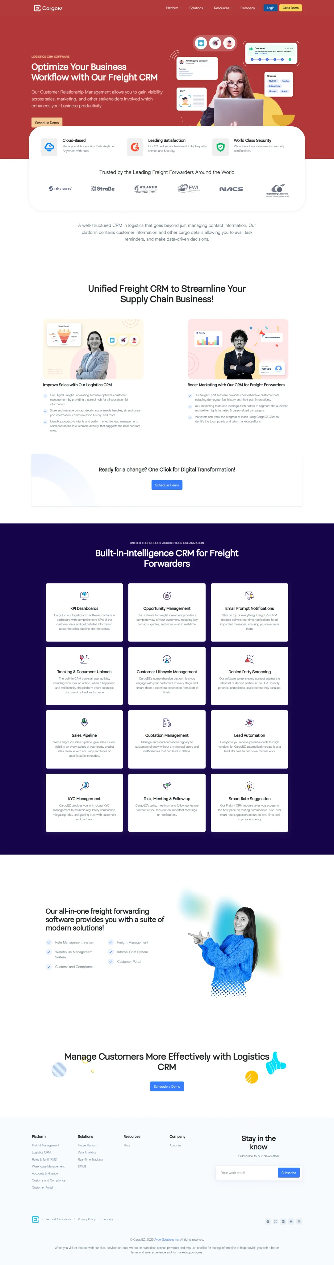
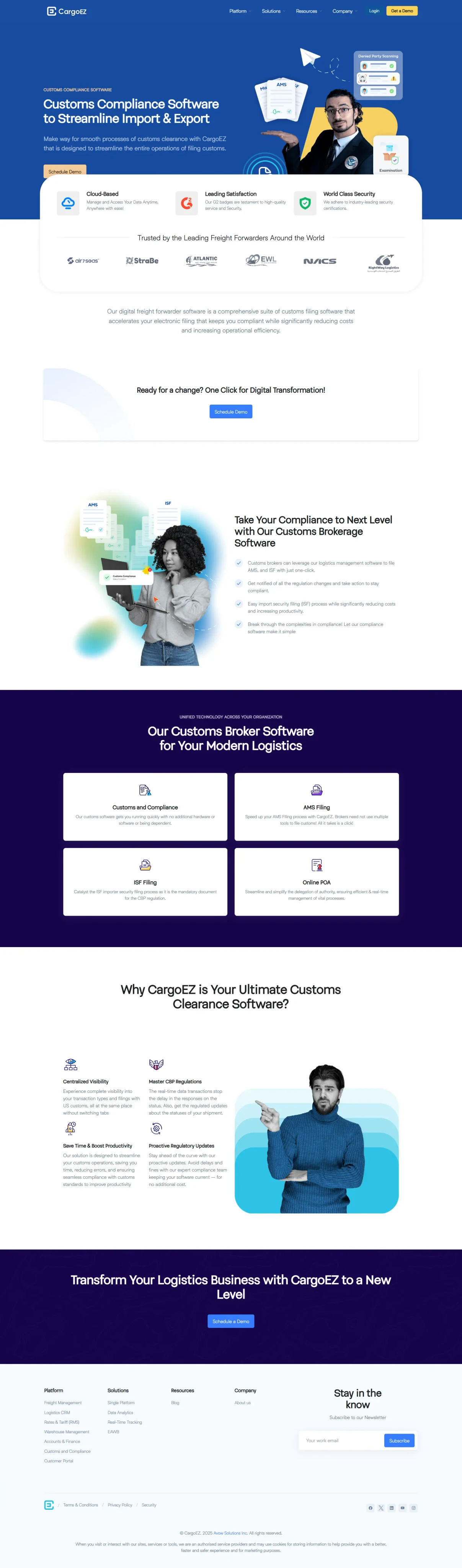
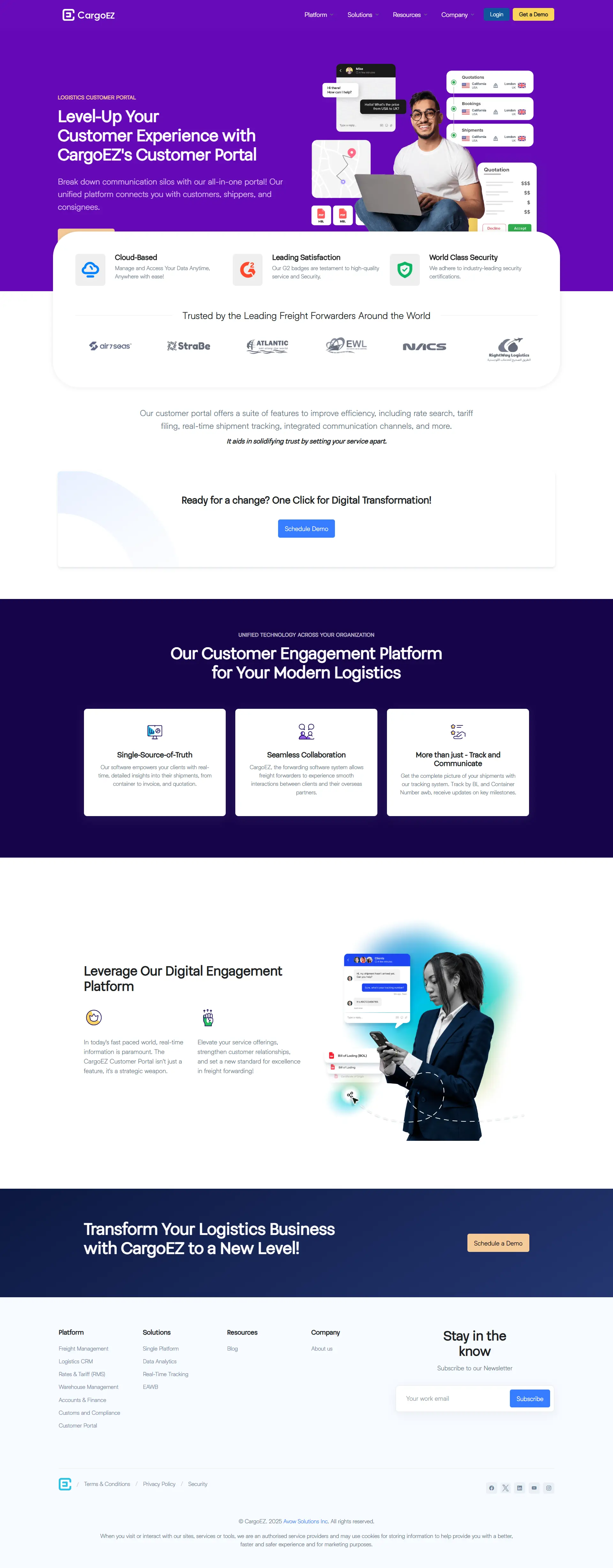
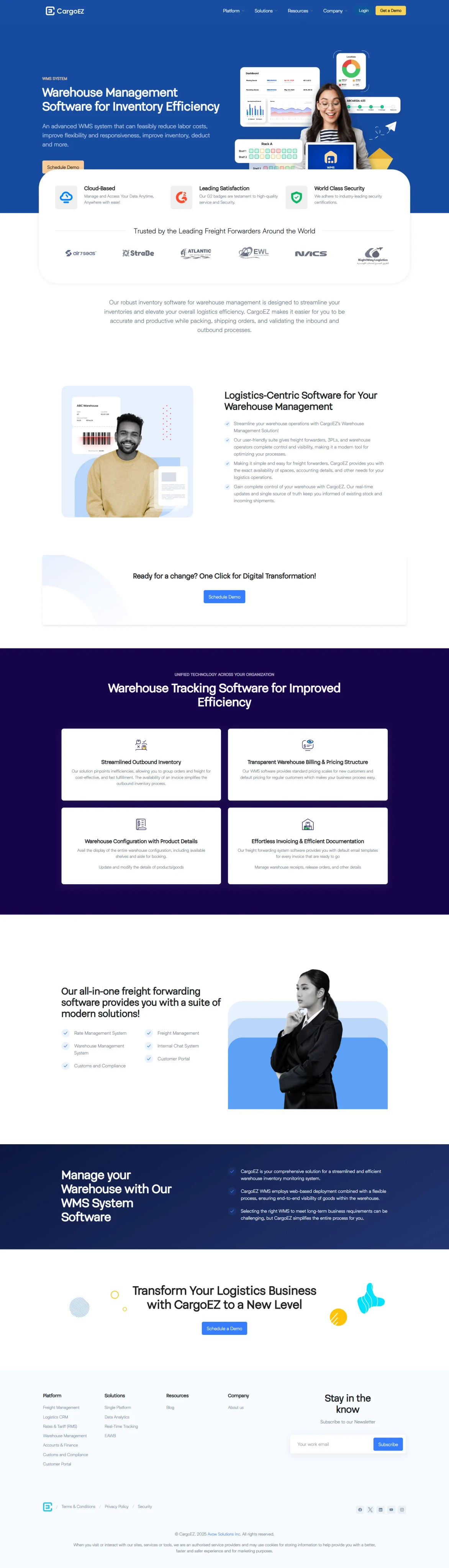
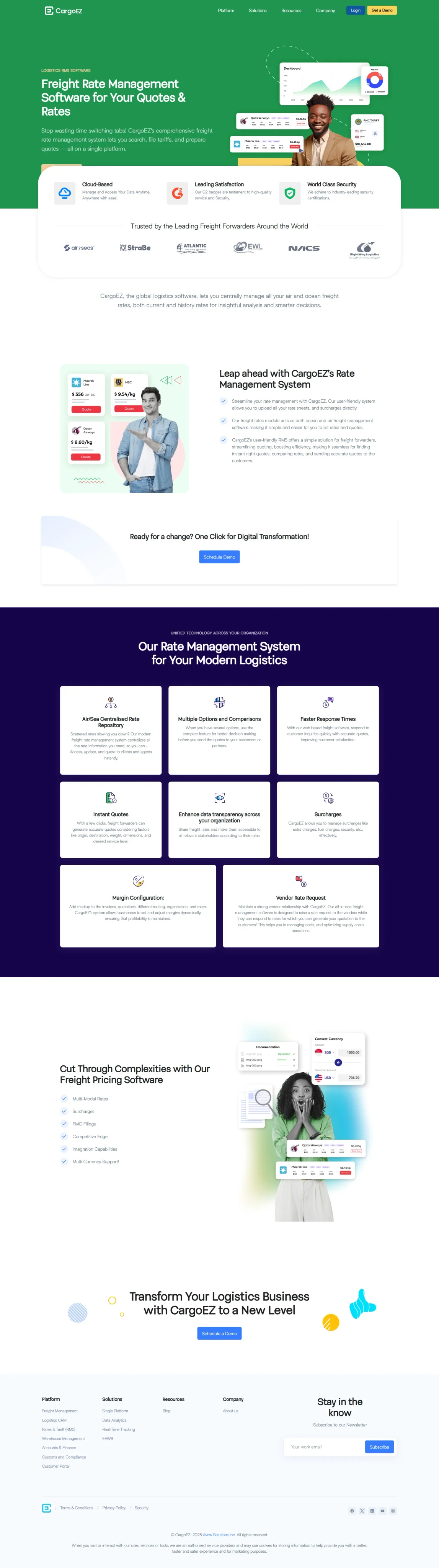
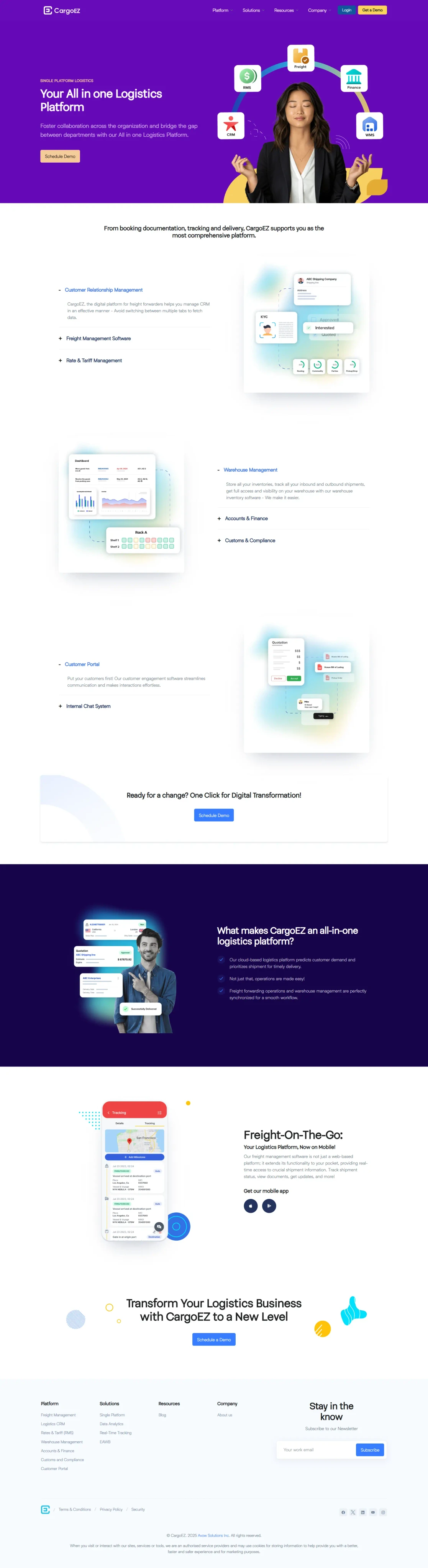
  • Introduced five clear top-level pages; Platform, Solutions, Resources, About, and Contact to reduce friction and make navigation more intuitive.

  • Grouped all feature-related content under a dedicated “Platform Modules” section, helping users understand what the product offers without digging through multiple pages.

  • Added anchor links that let users jump directly to key sections on long pages. This made the site easier to navigate, especially on mobile, where scrolling can feel slow and overwhelming.

UX Design & Content Strategy

UX Design & Content Strategy

  • Planned the flow from homepage to “learn more” to scheduling a demo

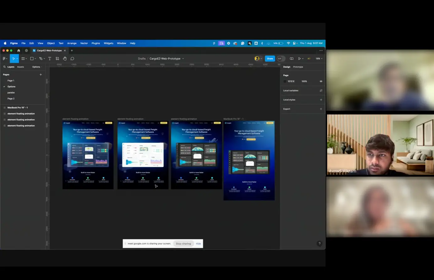
  • Built wireframes in Figma, prototyped them, tested with stakeholders, and made several iterations before final approval

  • Focused each section around what users need, from discovery to understanding to taking action

  • Broke down each module clearly (Freight, Finance, CRM, Rates, Warehouse, AMS, ISF)

  • Explained real use cases and outcomes based on different user roles

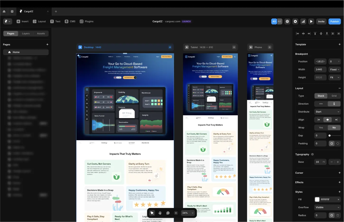
UI Design & Framer Development

This website was fully designed and built in Framer, which made the entire process faster and more efficient.

This website was fully designed and built in Framer, which made the entire process faster and more efficient.

  • Smooth design to development workflow with no handoff delays

  • Fully responsive layouts that worked well across all devices

  • Custom interactions and animations, built visually without writing code

  • Real-time publishing that made updates simple and fast

What I designed, I shipped. It was faster, cleaner, and fully in my control.

What I designed, I shipped. It was faster, cleaner, and fully in my control.

Key Visual & Technical Improvements

Interactive Experience

Design System

Component Reuse

CMS-Driven Content

Integrated smooth scroll animations, hover states, and micro-interactions to enhance flow and user feedback without overwhelming the interface.

Interactive Experience

Design System

Component Reuse

CMS-Driven Content

Integrated smooth scroll animations, hover states, and micro-interactions to enhance flow and user feedback without overwhelming the interface.

Interactive Experience

Design System

Component Reuse

CMS-Driven Content

Integrated smooth scroll animations, hover states, and micro-interactions to enhance flow and user feedback without overwhelming the interface.

SEO & Performance Outcomes

SEO Score Boosted

Increased from 65 to 88, improving search visibility and technical health.

Increased from 65 to 88, improving search visibility and technical health.

Content Reorganization

Refactored site structure and meta tags for clearer keyword alignment and improved crawlability.

Refactored site structure and meta tags for clearer keyword alignment and improved crawlability.

Improved Crawlability

Refined meta tags, headings, internal links, and page structure

Refined meta tags, headings, internal links, and page structure

Real-Time Content Management (CMS)
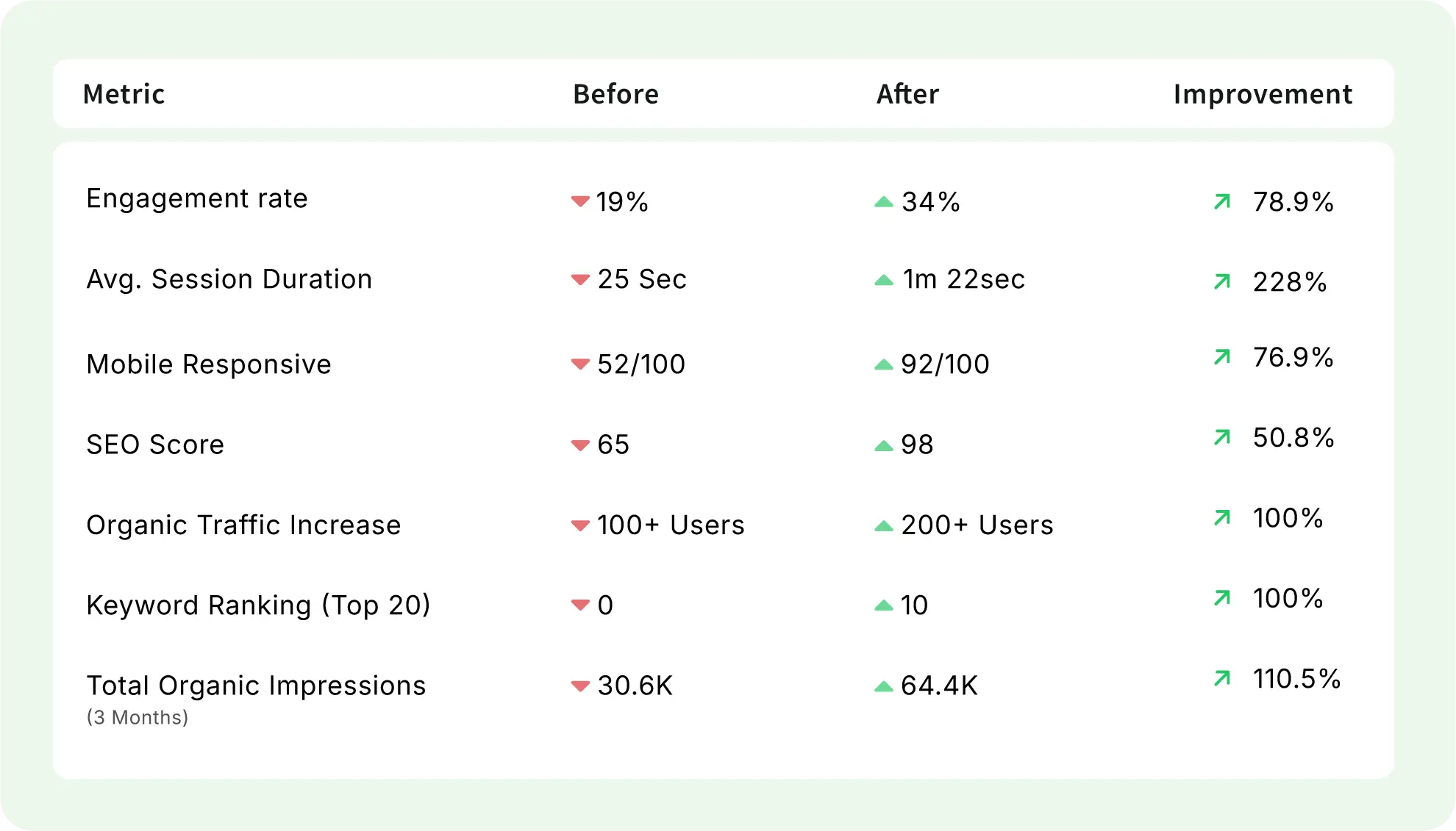
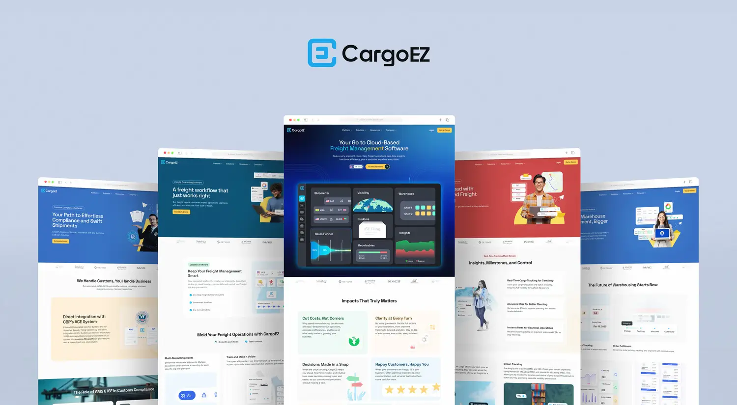
Blog and event content now editable by the marketing team through CMS ensuring agility and freshness

Blog and event content now editable by the marketing team through CMS ensuring agility and freshness

With CMS in place, anyone on the team can keep the site updated. No need for a designer or dev.

With CMS in place, anyone on the team can keep the site updated. No need for a designer or dev.

Before & After

CargoEZ Website Transformation
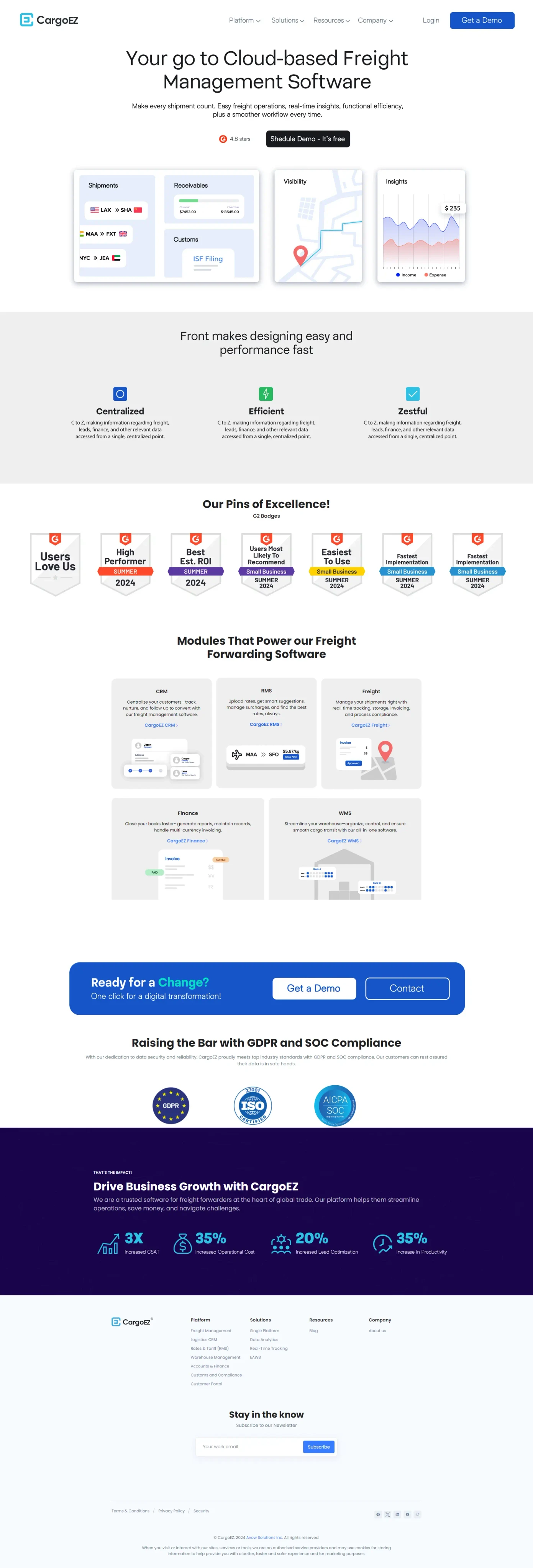
20%
20%

Why Framer ?

I chose Framer for this project because it allowed me to move from idea to production, without handoffs or compromises. It was the right tool for fast iteration, responsive layouts, and seamless animation.

I chose Framer for this project because it allowed me to move from idea to production, without handoffs or compromises. It was the right tool for fast iteration, responsive layouts, and seamless animation.

What Framer Enabled

Real-time preview + publishing

Breakpoint-based responsiveness

Micro-interactions with no-code motion

Design-token level consistency

Content updates by the marketing team without dev help

What I Learned

I discovered the importance of HTML tags and how they help Google’s algorithm interpret and prioritize content effectively for better search visibility.

I learned about schema markup scripts added to the <head> tag. Before this project, I had no experience with schema markup, but with guidance from an SEO specialist, I now understand the vital role it plays in boosting search engine rankings.

Using a CMS to build websites for blogs and events not only saves time but also empowers teams to update content easily, without needing design or coding skills.

Having the right tools makes a huge difference. With Framer, I was able to go from idea to live website in just a few days. Eliminating delays from developer handoff.

Credits

Product: CargoEZ - Product of Avow Solutions

Motion Graphics : Theoder Aldo (Homepage Lottie Animations)

Marketing & Content : Gokul Sankarlingam (SEO Specialist), Divya Murugan (Technical Writer) and Dharshini Balamurugan (Content Marketer)

Thanks to the stakeholders for continuous feedback

Final Thoughts

This redesign didn’t just make CargoEZ look better. It made it work better. It helped users understand the platform, engage deeper, and take action faster.

I handled the project from UX research to visual design to development, all inside Framer — proving that no-code doesn’t mean low quality. It means fast, focused, and frictionless.

Credits

This project was designed as part of my role at Avow Solutions Inc. CargoEZ is a product of Avow Solutions Inc., and all rights to the product belong to them. This portfolio entry showcases my design contributions, including UI/UX design, design system development, and prototyping.