Note:
This project is protected under an NDA, so no original information has been used in the mockup screens. I’m only able to share selected screens that have been approved by Avow Solutions. Additionally, due to company policy, the product name and competitor names are not disclosed in this case study.
Project Summary
Hypothesis
Context & Background
The Problem
The CRM was designed for desktops. Freight agents had no mobile-friendly access to perform essential tasks like quoting, approvals, document uploads, or follow-ups.
Quotation approval and sharing required desktop access
Vendor estimates had to be checked from email threads or desktop folders
KYC uploads weren’t possible from mobile
Agents couldn’t track deal stages or receive follow-up reminders
Contacts met at events were stored in personal notes or WhatsApp
User Research
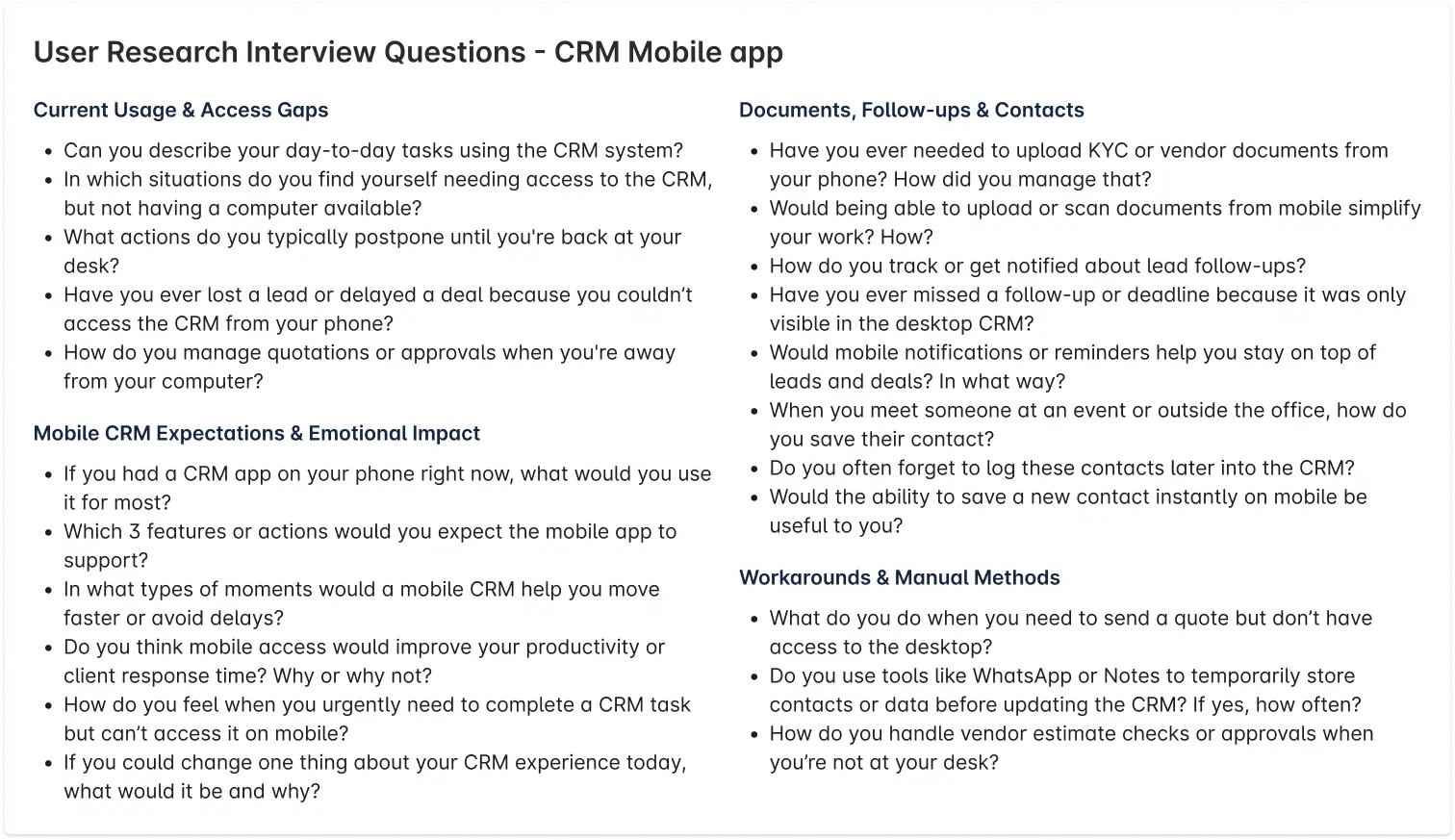
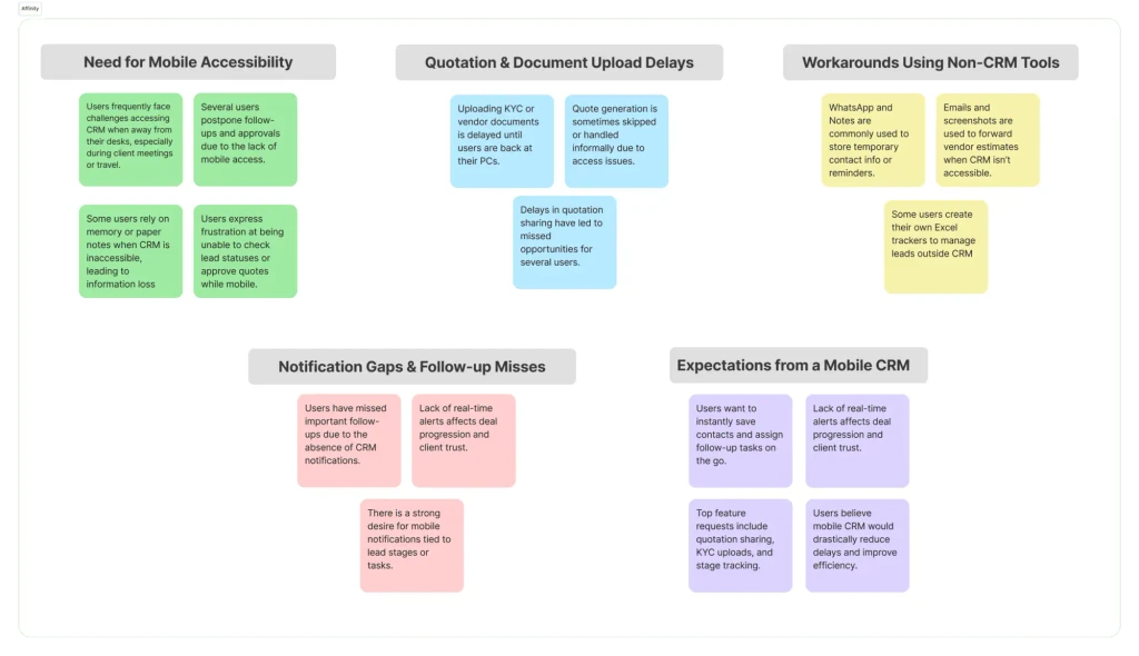
Insights
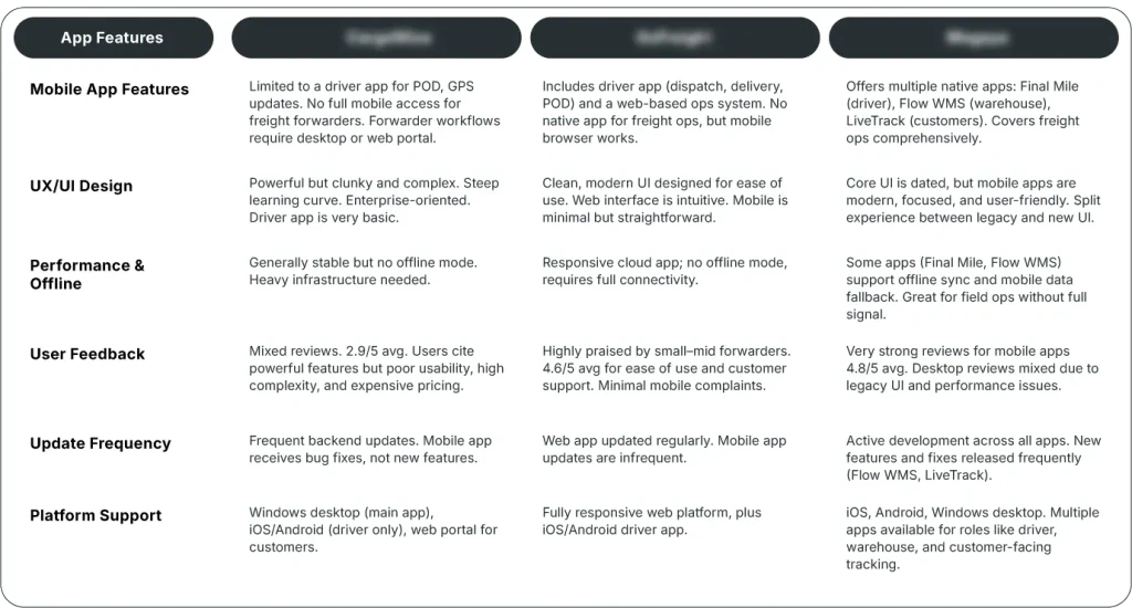
Competitor Analysis
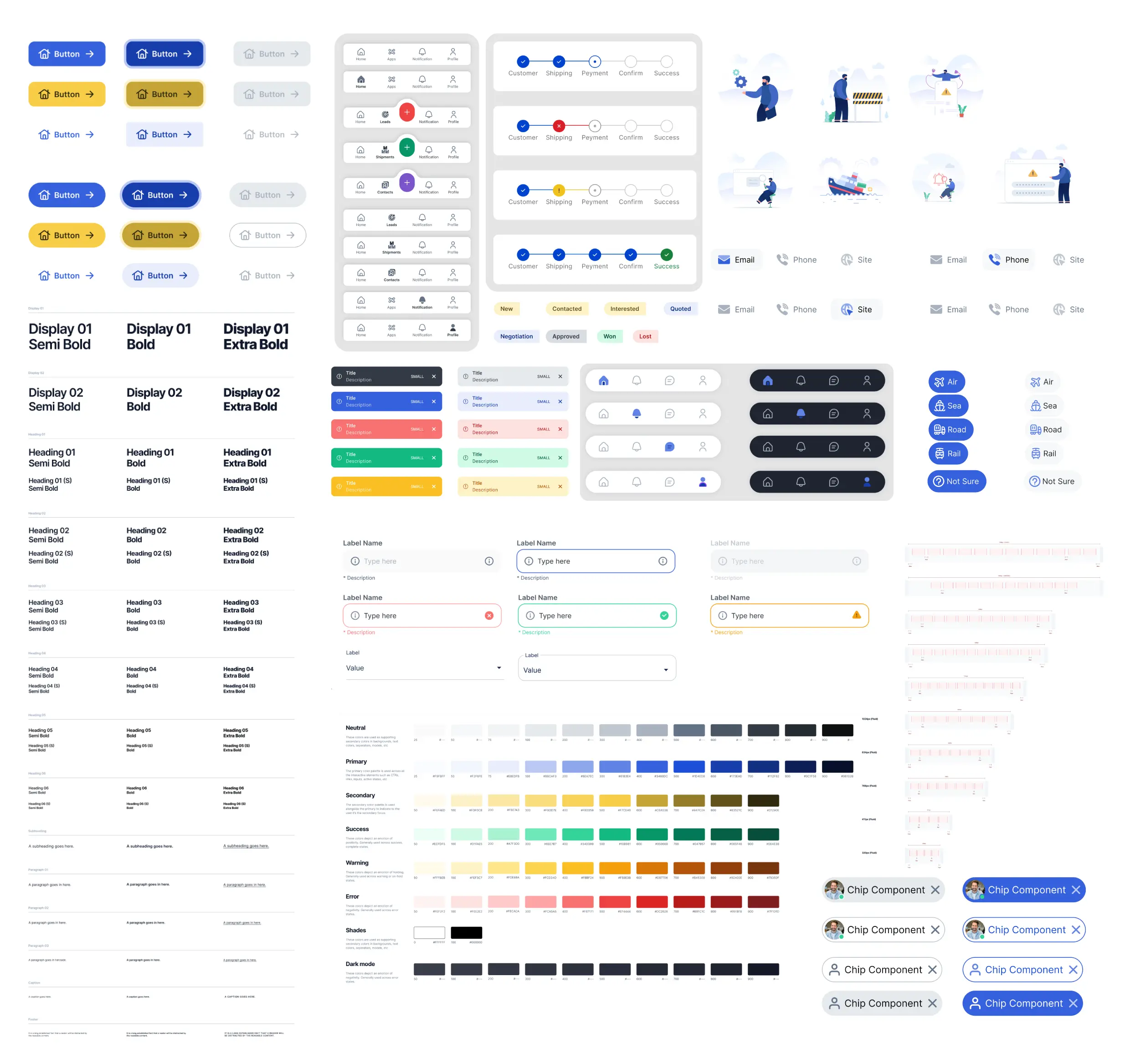
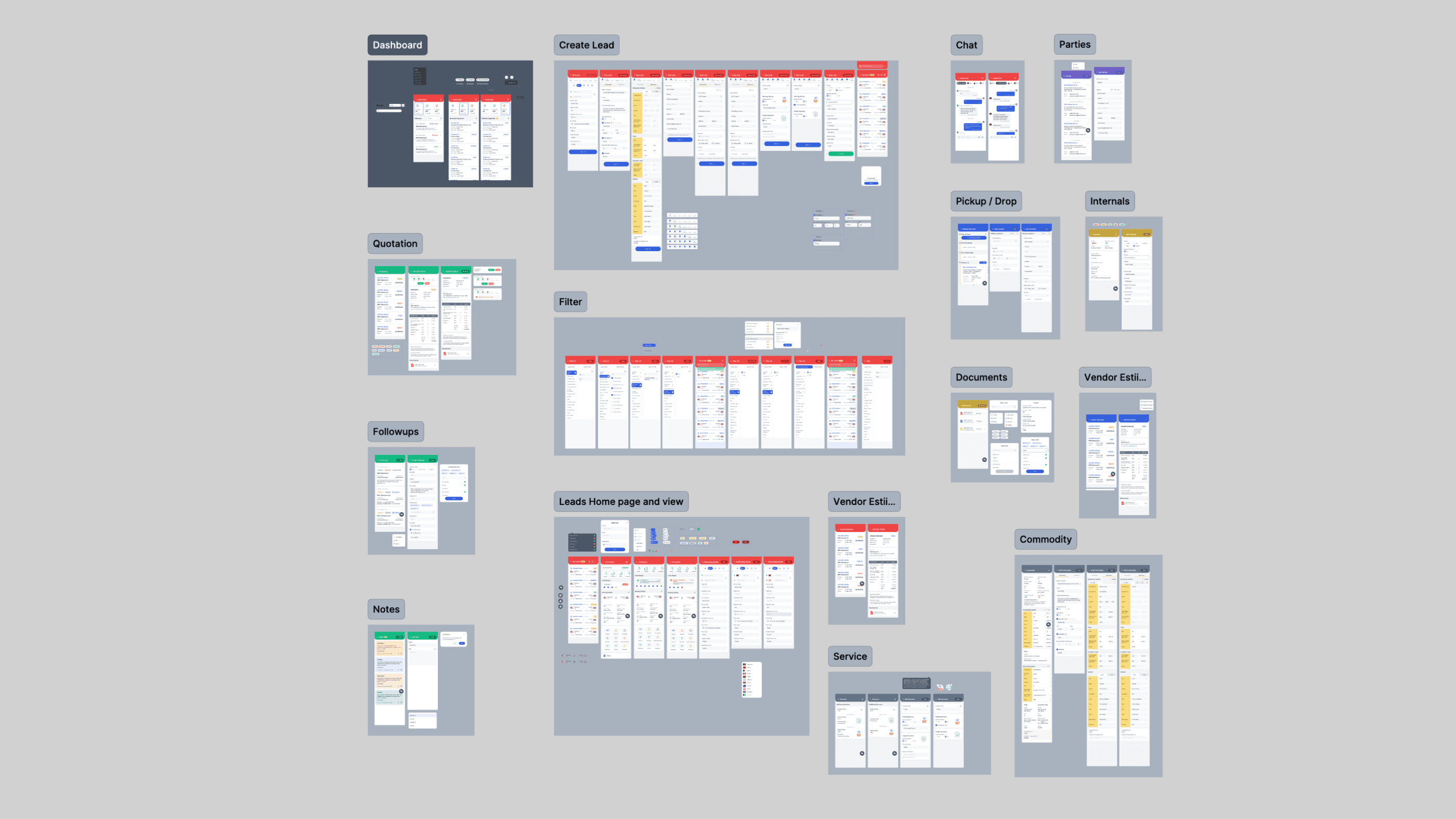
Building the Design System
To keep things scalable and consistent, I built the design system using the Atomic Design Methodology organizing everything into atoms, molecules, organisms, templates, and pages.
This structured approach helped in more ways than one:
It ensured visual consistency across screens
Made components reusable and easier to maintain
Helped the developer implement faster with clearly defined UI patterns
From typography and color tokens (atoms) to cards, inputs, and lead modules (organisms), everything was designed with reusability in mind. The system also made it easy to extend the design later, whether for new features or other platforms.
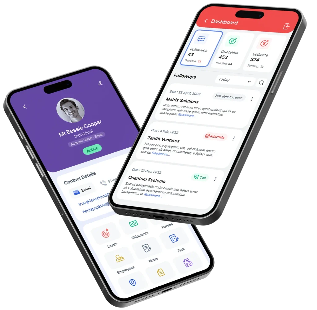
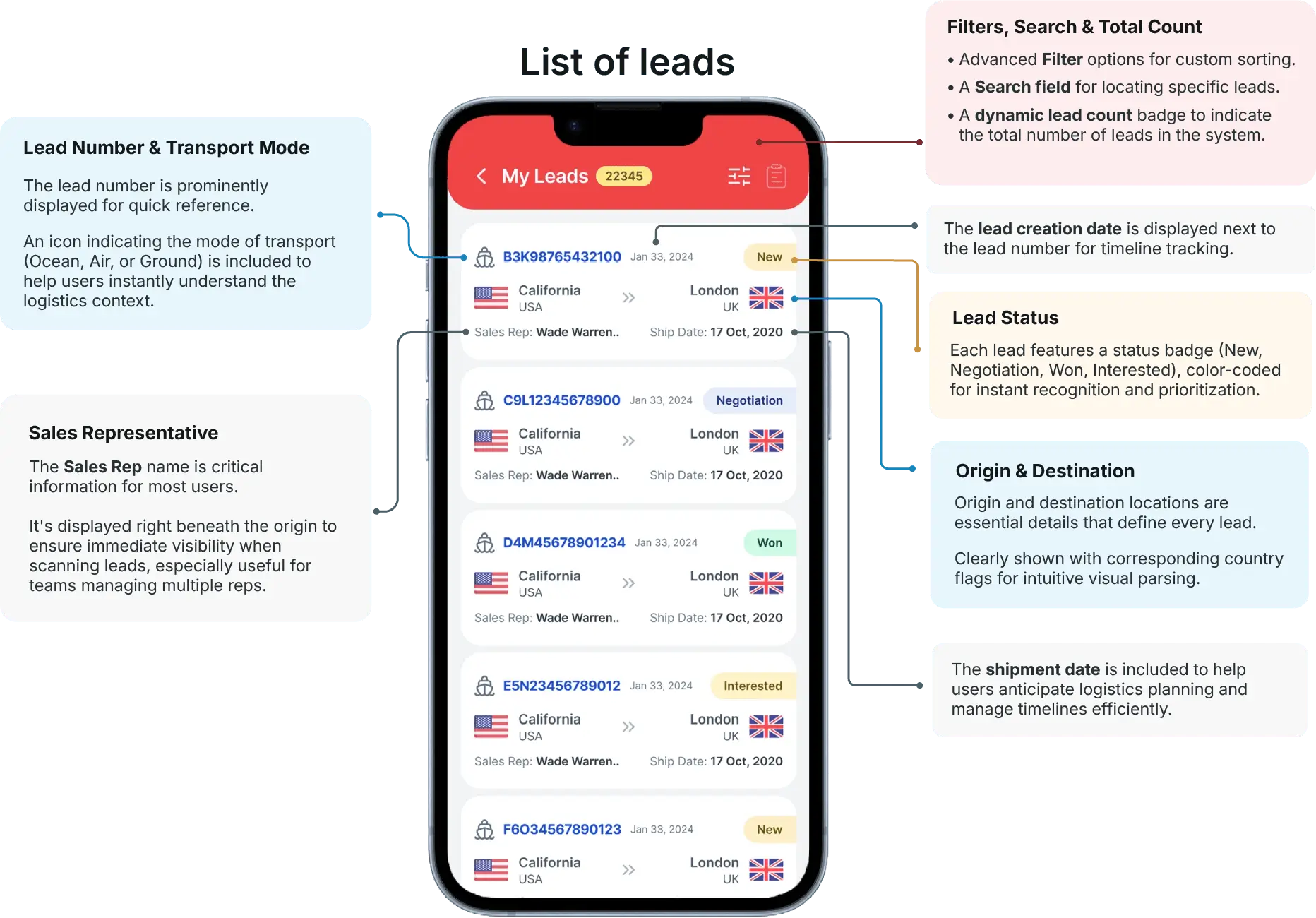
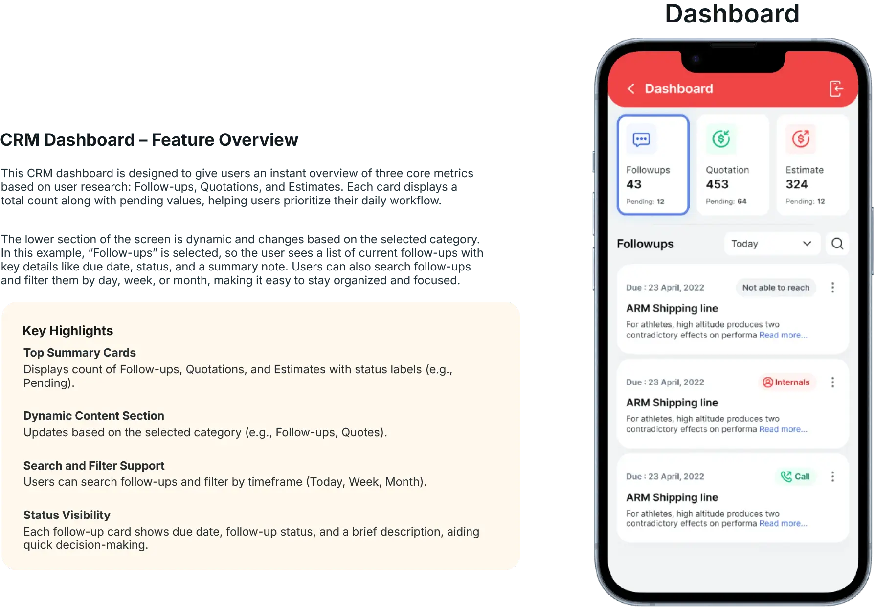
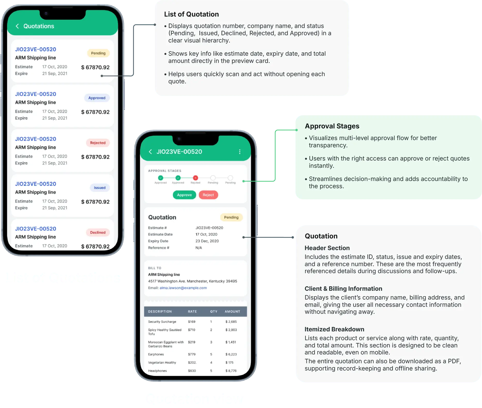
Designing the Interface
Once I had a strong understanding of what users needed most on mobile, I moved into interface design.
I focused on creating a minimal, intuitive UI with just the essentials:
A clean dashboard with KPIs and reminders
Lead profiles with editable stages and notes
Simple flows for quotations, follow-ups, and document uploads
I prioritized clarity, tap-friendly spacing, and visual hierarchy knowing that users might be using the app while walking or driving between locations.
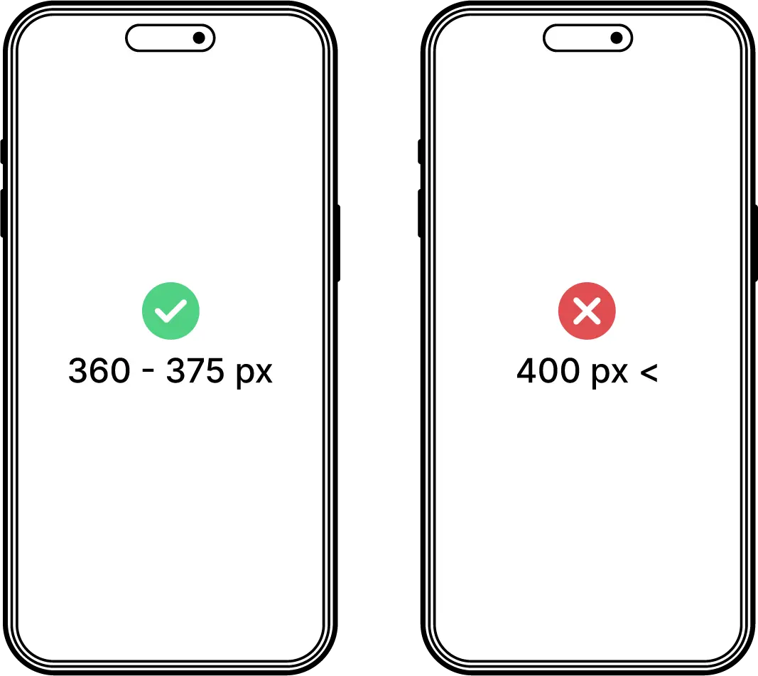
A Hard Lesson on Responsive Design
Iteration & Feedback
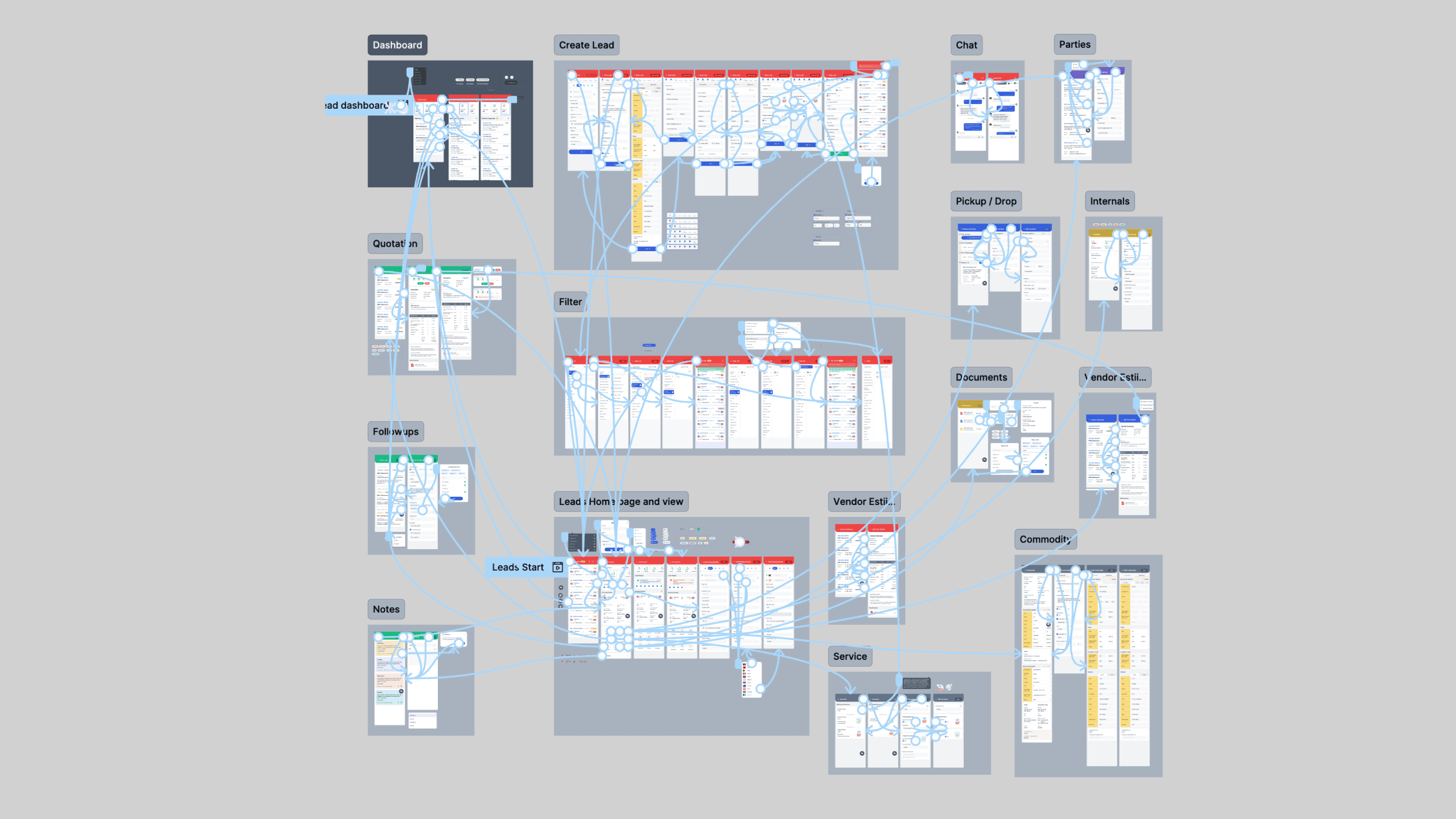
My Workflow: Developer-Friendly & Organized
Results & Impact
Post-launch, within 2 weeks of internal rollout:
76% adoption rate among users
80% of users reported their core needs were met
85% user satisfaction rate
Consistently positive feedback from customers
The app was successfully launched across both Android and iOS platforms.
Credits
Mobile Developers: Kumaran Karunakaran and Kathiresan S
QA Engineer: Kishore
Thanks to the stakeholders for continuous feedback
My Learnings
Designing for real devices matters.
Early in the project, I learned that designing at 430px without accounting for device settings caused unexpected font scaling issues. Since then, I always start with the right breakpoints and test on real devices early.
Developer collaboration isn't just about handoff. it's about empathy.
I structured my Figma files for clarity, used constraints and grids. This reduced confusion and made implementation smoother, especially in a resource-constrained setup.
Owning both research and design solo builds confidence fast.
Doing this end-to-end from competitor research to UI system to final handoff, taught me how to be self-reliant, ask better questions, and design with both product and people in mind.
Credits
This project was designed as part of my role at Avow Solutions Inc and all rights to the product belong to them. This portfolio entry showcases my design contributions, including UI/UX design, design system development, and prototyping.